Components • 17th September, 2021 • 4 mins read
How to make a Feedback Component to seamlessly collect reviews in React.JS
 Parmeet Singh
For a business, customer feedback happens to be one of the most reliable ways to know how they are doing. As Developer, we should try and make this process as intuitive and simple as possible.
This article aims to explain, how we could develop a customer feedback component using React, Lottie Web & Framer Motion. So let's get started with it then! 😉
Project Initialization
npx create-react-app emoji-feedback
Install Dependencies
- React Lottie for integrating Lottie animations
- Framer Motion for micro-interactions
- Styled Components for styling needs
yarn add react-lottie framer-motion styled-components
Animated Emojis
To get the emojis to animate, we have 2 options:
- Animated emoji pack (Mostly Paid)
- Lottie Animations (Free & Paid)
I went with the 2nd option for this one. The animations used in this component are by jkkim0124. Simply select your favorite animations and place them under the src/lotties folder.
Component Breakdown
App Component
Call the Emoji Feedback component along with the necessary state props.
// Reactimport { useState } from "react";// Externalimport styled from "styled-components";// Componentsimport EmojiFeedback from "./components/EmojiFeedback";const AppStyles = styled.div`display: flex;align-items: center;justify-content: center;height: 100vh;background-color: #f8ebe2;`;const App = () => {const [activeReaction, setActiveReaction] = useState("");return (<AppStyles><EmojiFeedbackactiveReaction={activeReaction}setActiveReaction={setActiveReaction}/></AppStyles>);};export default App;
Constants
Declare an array containing strings of the various supported reactions.
const reactions = ["Aweful", "Bad", "Ok Ok", "Good", "Amazing"];export { reactions };
Emoji Feedback Component
Loop through the reactions and then call the Emoji component for every reaction.
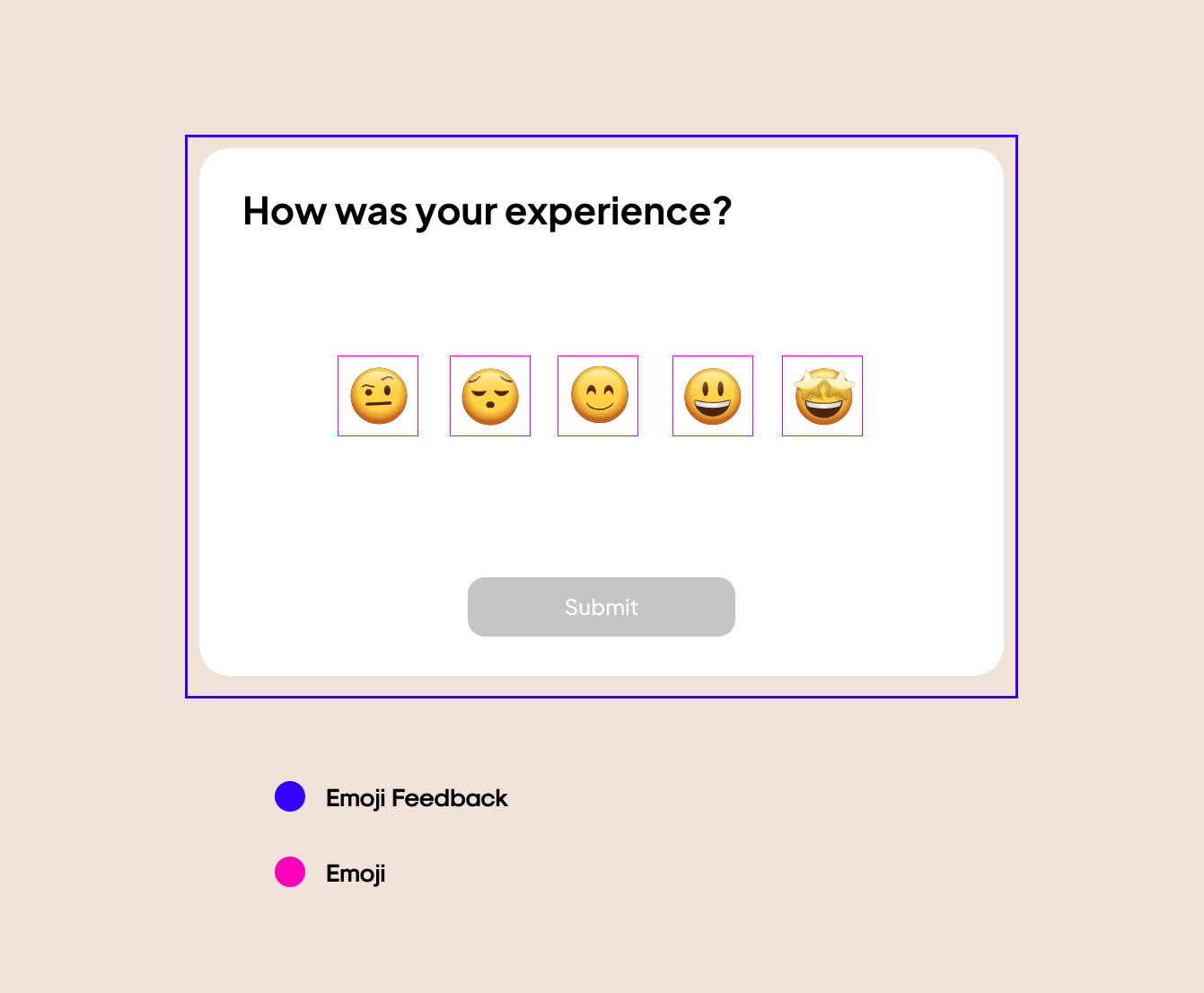
// Externalimport styled from "styled-components";// Componentsimport Emoji from "./Emoji";import { Flex } from "../../styles/globalStyles";// Reactions arrayimport { reactions } from "./data";const Card = styled.div`width: 800px;height: 500px;background-color: #fff;border-radius: 33px;padding: 44px 48px;box-shadow: 0 8px 24px rgba(0, 0, 0, 0.15);@media only screen and (max-width: 930px) {width: 80%;}`;const Heading = styled.h2`font-size: 42px;font-weight: bold;margin: 0;color: #000;font-family: Plus Jakarta Sans Bold;`;const Content = styled(Flex)`height: 452px;position: relative;`;const Emojis = styled(Flex)`top: 30%;`;const Button = styled.button`background-color: ${props => (props.isSelected ? "#000" : "#ccc")};cursor: ${props => (props.isSelected ? "pointer" : "not-allowed")};border: none;color: #fff;padding: 19.5px 107.3px;border-radius: 19px;font-family: Plus Jakarta Sans Medium;font-size: 24px;user-select: none;position: absolute;bottom: 0;`;const EmojiFeedback = ({ activeReaction, setActiveReaction }) => {return (<Card><Heading>How was your experience?</Heading><Content column><Emojis>{reactions.map(reaction => (<Emojireaction={reaction}key={reaction}isSelected={activeReaction === reaction}setActiveReaction={setActiveReaction}/>))}</Emojis><Button isSelected={!!activeReaction}>Submit</Button></Content></Card>);};export default EmojiFeedback;
Emoji Component
The emoji component is being used to render a single emoji.
// Externalimport Lottie from "react-lottie";import { motion } from "framer-motion";import styled from "styled-components";// Helper for handling lottie animation dataimport selectAnimationData from "../../lotties";const EmojiWrapper = styled(motion.div)`cursor: pointer;margin: 0 12px;position: relative;`;const EmojiLabel = styled.p`text-align: center;position: absolute;bottom: -32px;left: 50%;transform: translate(-50%, -50%);font-family: Plus Jakarta Sans Bold;font-size: 16px;user-select: none;`;// Constants for emoji's scale during different statesconst NORMAL_SCALE = 1;const HOVERED_SCALE = 1.3;const SELECTED_SCALE = 1.5;const Emoji = ({ reaction, isSelected, setActiveReaction }) => {// Initialize the animation options as per the reactionconst animationOptions = {loop: true,autoplay: false,animationData: selectAnimationData(reaction),rendererSettings: {preserveAspectRatio: "xMidYMid slice",},};// Update state on the click of reactionconst handleClick = () => {if (isSelected) {setActiveReaction("");} else {setActiveReaction(reaction);}};return (<EmojiWrapperwhileHover={{scale: isSelected ? SELECTED_SCALE : HOVERED_SCALE,}}animate={{scale: isSelected ? SELECTED_SCALE : NORMAL_SCALE,}}onClick={handleClick}><Lottieoptions={animationOptions}height={100}width="80%"isStopped={!isSelected}isClickToPauseDisabled/>{isSelected && <EmojiLabel>{reaction}</EmojiLabel>}</EmojiWrapper>);};export default Emoji;
Conclusion
And there we have it, the emoji feedback component is ready. The Code is available on Github. Would love to hear your valuable feedback in the comments down below.
See you guys 👋🏻 in the next article of this Component series!
Happy coding & Stay safe! ✨